Heerlijkheid Breust
Is it a pub, or is it a restaurant?
Challenge
Heerlijkheid Breust has grown from a cozy beer café into a central place where people eat and drink. The (main) message is therefore not (anymore) clear. The target group has shifted to a different audience. We want to capture and convey the character of HB in both text and images. Authentic, personal and casual. With a sense of humour. Distinctive.
Solution
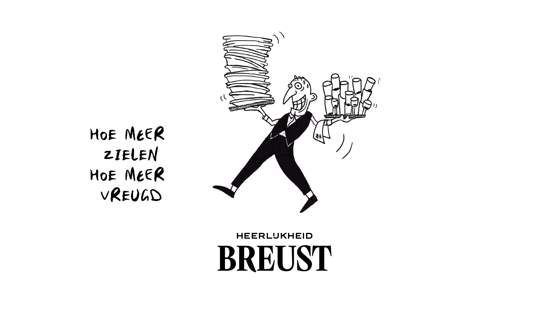
We don't profile HB as a pub, not as a brasserie, not as a snack bar... But as a delight: A meeting place where people come to enjoy the good things in life in a casual atmosphere. How do we do that: We draw parallels with the Roman Catholic Church. We do this with humor and light (self) mockery.
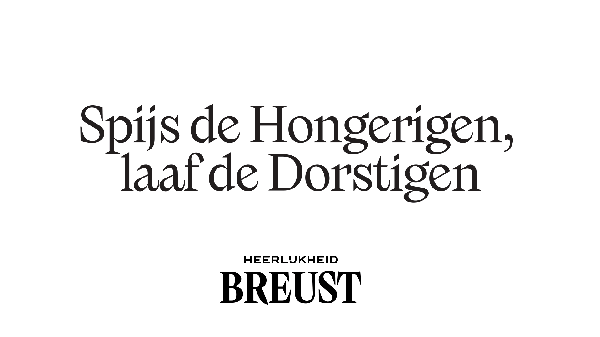
HB is located directly next to Sint Martin's church in Breust-Eijsden. Saint Martin gave half of his cloak to a numb fellow man. This compassionate thought of sharing is the basis for our central message.
Feed the hungry and quench the thirsty
With this tasty task, Heerlijkheid Breust is here on earth. A new visual style provides the new communication concept with a touch of humour. The delightful illustrations are drawn by Janine den Hartog.
More coming soon ...

